DawgChart
The next gen of online health management tool. (MyChart redesign)
Duration
6 weeks
Role
UI/UX designer
UX researcher
Product manager
Tools
Figma
Team
Jingzhou Ma
Steve Wu
Ollie Le

Project Overview
Summary
This class project focuses on experimenting with finding existing issue from user research and making a better version of a website on our choice with better implementation of user experience.
My Part
Directed the research progress and facilitated brainstorming sessions.
Conceptualized and designed all wireframes.
Built information architecture for a clean user experience.
Formulated and structured interview and survey questions, and conducted comprehensive interviews.
Crafted multiple reusable components in Figma using a flex-box format.
Designed and enhanced user flow prototypes in Figma for optimal performance.
Challenge
Short Timeframe: Limited duration prevented creating a full component set and required tightly scheduled interviews, impacting research depth.
Unparticipating teammates: Out of five teammates, two contributed minimally, leaving a three-person team to manage an overwhelming workload and maintain project momentum under significant pressure.
The Problem Background
MyChart is an online health management tool that allows patients to access their medical records, communicate with healthcare providers, schedule appointments, and manage their health information securely.
However, it has information architecture flaws that need to be redesigned to improve user experience and accessibility.

Final Design
Our final deliverable is a desktop website designed to streamline the healthcare experience, enabling users to communicate with doctors, schedule appointments, view test results, and refill prescriptions seamlessly.

LOGIN / PROFILE
Login and profile page can choose the specific hospital's system you want to be on.
LOGIN / PROFILE
Login and profile page can choose the specific hospital's system you want to be on.
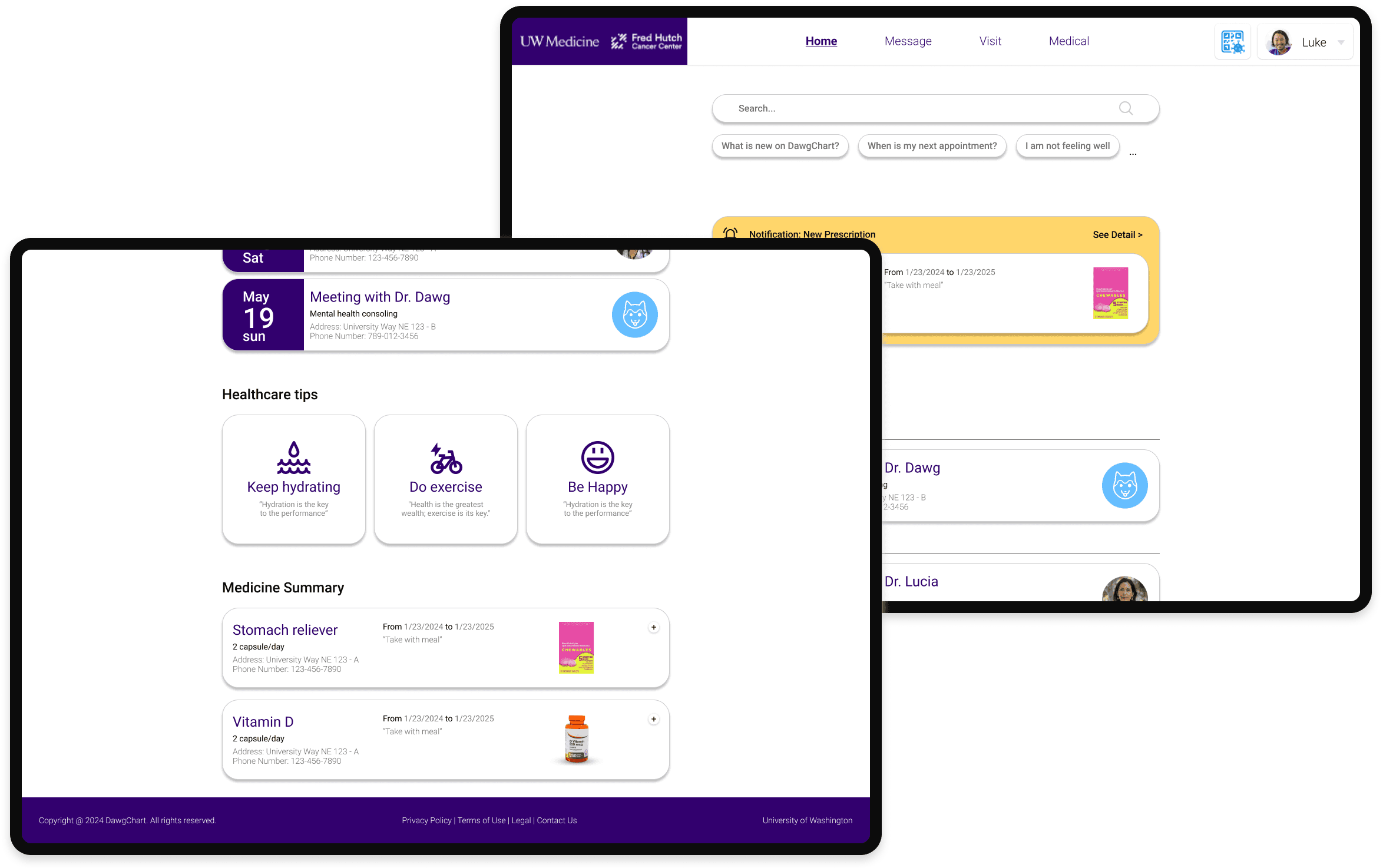
HOME PAGE
Home page now includes AI search feature, also has sections to most used features.
HOME PAGE
Home page now includes AI search feature, also has sections to most used features.
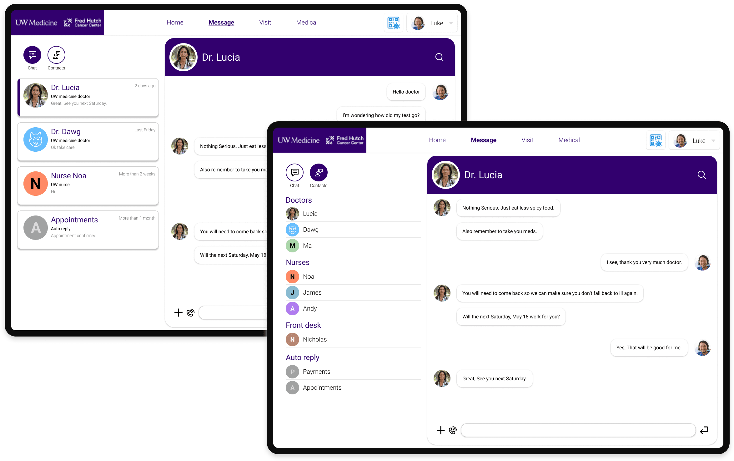
MESSAGE
Message page now allows you to easily find your care team with contact system.
MESSAGE
Message page now allows you to easily find your care team with contact system.
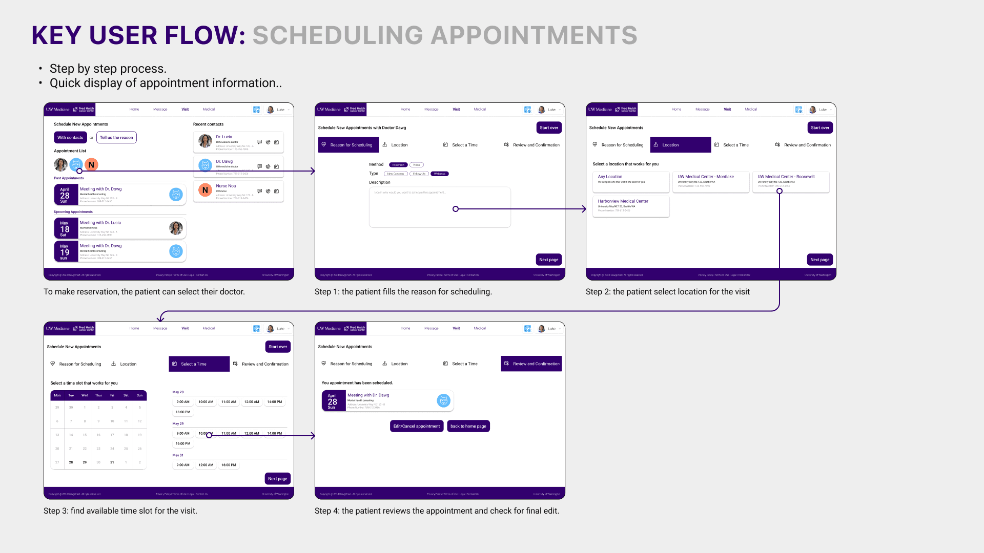
VISIT
On visit page, you can now easily find future and past visits. You can also make appointment directly.
VISIT
On visit page, you can now easily find future and past visits. You can also make appointment directly.


Process
Week 1-2
Research
Define Problem
User Research
Research Analysis
Week 3
Iteration
Brainstorm
UX Strategy
Week 4-5
Design
Design System
Information Architecture
Prototyping
Week 6
Optimization
Refinement
Research
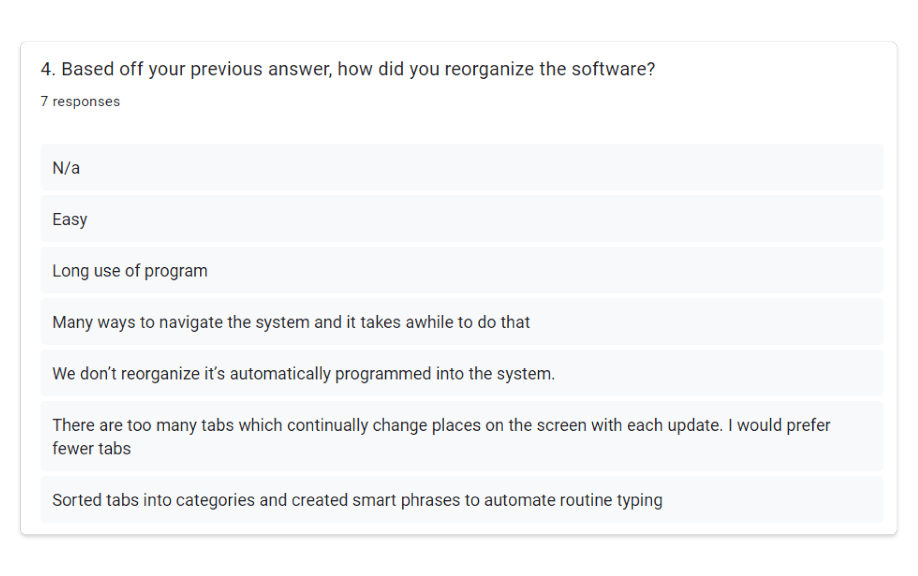
Our team conducted interviews with multiple doctors and patients who regularly use MyChart. Additionally, we distributed numerous surveys to gather comprehensive feedback.
Survey
Surveys for both health providers and patients also emphasizes on similar paterns.
Survey
Surveys for both health providers and patients also emphasizes on similar paterns.
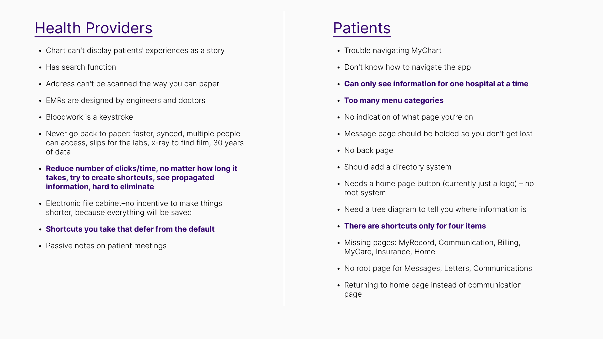
Problems
HOSPITALS WITH DIFFERENT ACCOUNTS
There is no central place where you can access all hospitals; instead, you have to go to the MyChart for each individual hospital.
HARD TO FIND CORRECT PAGES
Many users of MyChart often lose track of what page they are on, making it difficult for them to find the information they need, even for simple tasks.
TOO MANY CLICKS
MyChart often presents an information overload, with data nested in a deep information architecture that requires multiple clicks to access.
How might we…
create a centralized, user-friendly MyChart platform that simplifies navigation and reduces the number of clicks needed to access critical healthcare information?
Brainstorm
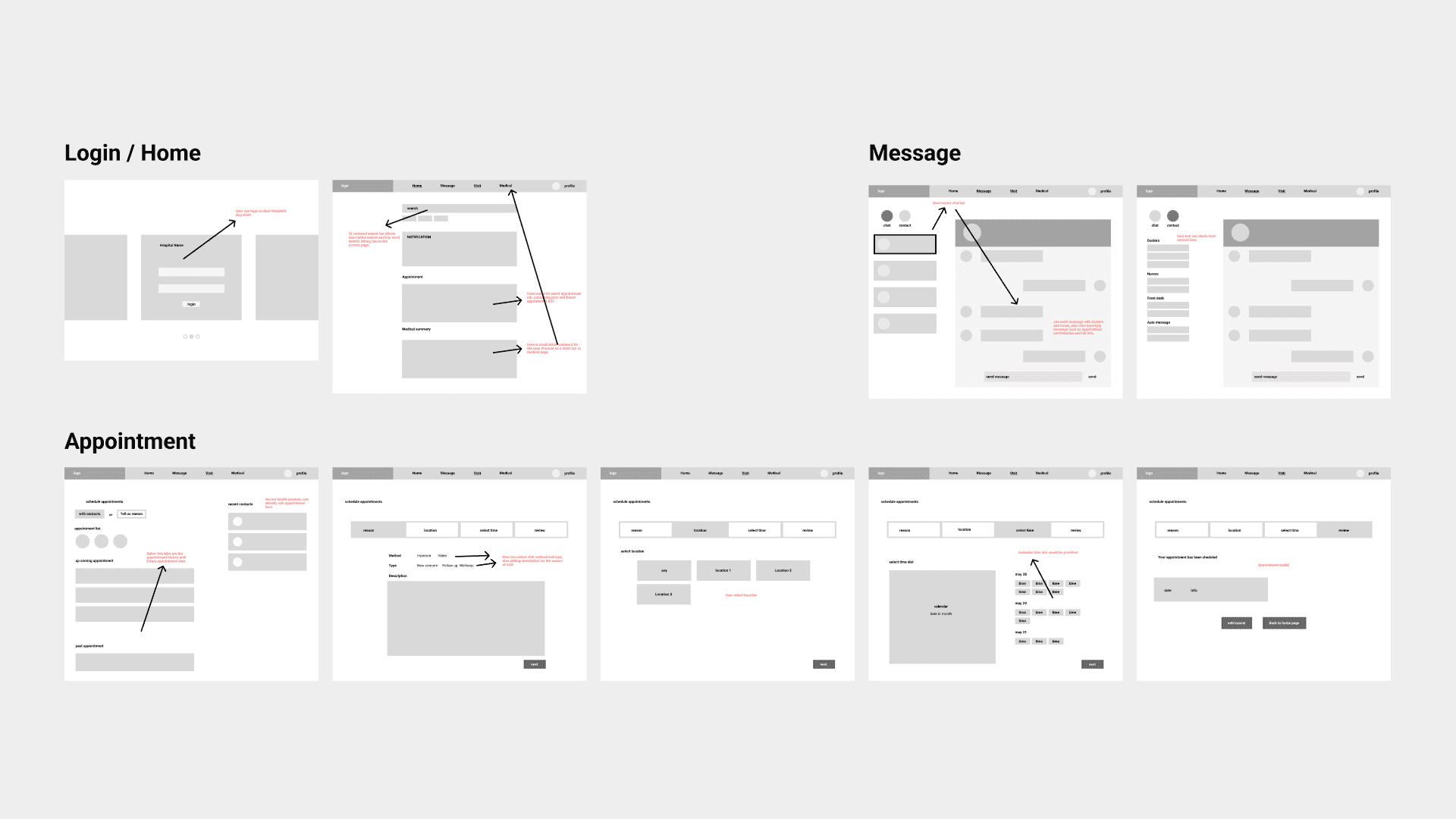
Our team then initiated an intensive wireframe brainstorming session to address the above problems, specifically focusing on fixing the information architecture.


Work in Progress

Components building
In order to make prototyping more fluent as well as practicing preparing for scale up, my team and I build the component in flex-box format in Figma.
Components building
In order to make prototyping more fluent as well as practicing preparing for scale up, my team and I build the component in flex-box format in Figma.
Prototype
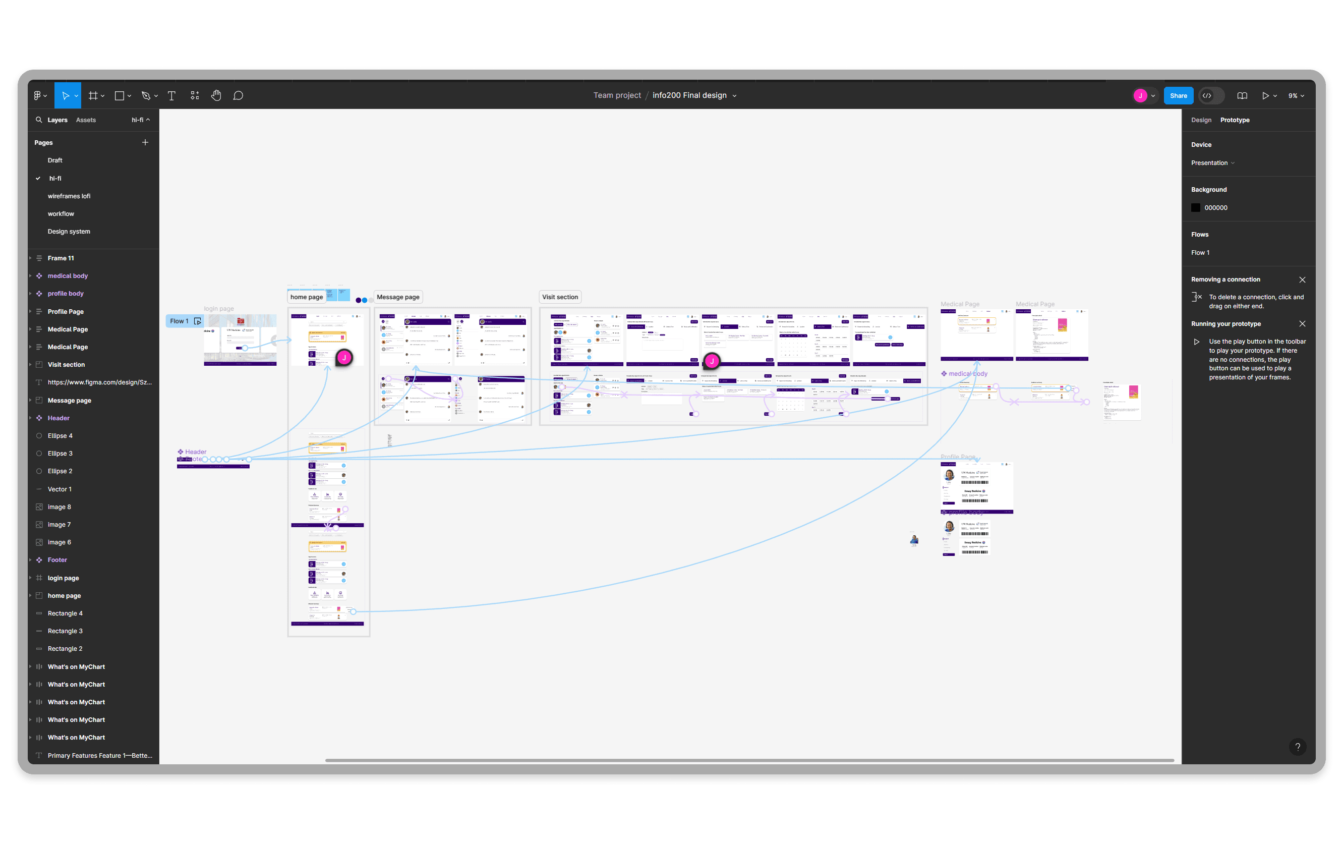
After completing the component, my team and I starts to build prototype on Figma using components, which centuralized nodes connections.
Prototype
After completing the component, my team and I starts to build prototype on Figma using components, which centuralized nodes connections.
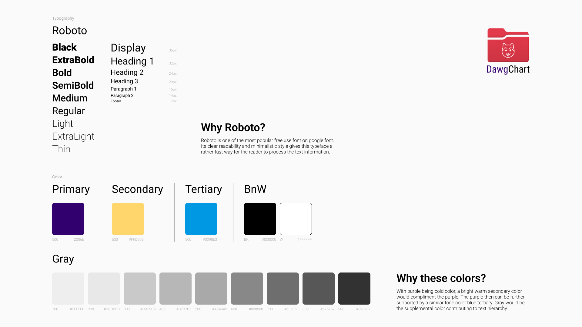
Design system
Below are the design system and structure for us to follow when conducting website design.

Prototype
08 - Conclusion
What I learned?
Regular team meetings would speed up the process and keep team members engaged.
If I had more time...
We would make full prototype with micro-interaction animation on Protopie.
DawgChart
The next gen of online health management tool. (MyChart redesign)
Duration
6 weeks
Role
UI/UX designer
UX researcher
Product manager
Tools
Figma
Team
Jingzhou Ma
Steve Wu
Ollie Le
Project Overview
Summary
This class project focuses on experimenting with finding existing issue from user research and making a better version of a website on our choice with better implementation of user experience.
My Part
Directed the research progress and facilitated brainstorming sessions.
Conceptualized and designed all wireframes.
Built information architecture for a clean user experience.
Formulated and structured interview and survey questions, and conducted comprehensive interviews.
Crafted multiple reusable components in Figma using a flex-box format.
Designed and enhanced user flow prototypes in Figma for optimal performance.
Challenge
Short Timeframe: Limited duration prevented creating a full component set and required tightly scheduled interviews, impacting research depth.
Unparticipating teammates: Out of five teammates, two contributed minimally, leaving a three-person team to manage an overwhelming workload and maintain project momentum under significant pressure.
The Problem Background
MyChart is an online health management tool that allows patients to access their medical records, communicate with healthcare providers, schedule appointments, and manage their health information securely.
However, it has information architecture flaws that need to be redesigned to improve user experience and accessibility.
Final Design
Our final deliverable is a desktop website designed to streamline the healthcare experience, enabling users to communicate with doctors, schedule appointments, view test results, and refill prescriptions seamlessly.
LOGIN / PROFILE
Login and profile page can choose the specific hospital's system you want to be on.
HOME PAGE
Home page now includes AI search feature, also has sections to most used features.
MESSAGE
Message page now allows you to easily find your care team with contact system.
VISIT
On visit page, you can now easily find future and past visits. You can also make appointment directly.
Process
Week 1-2
Research
Define Problem
User Research
Research Analysis
Week 3
Iteration
Brainstorm
UX Strategy
Week 4-5
Design
Design System
Information Architecture
Prototyping
Week 6
Optimization
Refinement
Research
Our team conducted interviews with multiple doctors and patients who regularly use MyChart. Additionally, we distributed numerous surveys to gather comprehensive feedback.
Survey
Surveys for both health providers and patients also emphasizes on similar paterns.
Problems
HOSPITALS WITH DIFFERENT ACCOUNTS
There is no central place where you can access all hospitals; instead, you have to go to the MyChart for each individual hospital.
HARD TO FIND CORRECT PAGES
Many users of MyChart often lose track of what page they are on, making it difficult for them to find the information they need, even for simple tasks.
TOO MANY CLICKS
MyChart often presents an information overload, with data nested in a deep information architecture that requires multiple clicks to access.
How might we…
create a centralized, user-friendly MyChart platform that simplifies navigation and reduces the number of clicks needed to access critical healthcare information?
Brainstorm
Our team then initiated an intensive wireframe brainstorming session to address the above problems, specifically focusing on fixing the information architecture.
Work in Progress
Components building
In order to make prototyping more fluent as well as practicing preparing for scale up, my team and I build the component in flex-box format in Figma.
Prototype
After completing the component, my team and I starts to build prototype on Figma using components, which centuralized nodes connections.
Design system
Below are the design system and structure for us to follow when conducting website design.
Prototype
08 - Conclusion
What I learned?
Regular team meetings would speed up the process and keep team members engaged.
If I had more time...
We would make full prototype with micro-interaction animation on Protopie.