National Park service
A tool to explore more than 400 national parks nationwide (NPS redesign).
Duration
6 weeks
Role
UI/UX designer
UX researcher
Tools
Figma
After Effect
Team
Jingzhou Ma
Alicia Betty
Stephanie Chou
Steve Wu
Project Overview
Summary
This class project, assigned by Bill Flora (Strategic Consultant and Creative Director in NYT), focuses on redesigning an app for travel planning and news checking.
My Part
Facilitated team progress with regular checkpoints and synchronized updates.
Conducted comparative analysis across similar apps.
Built information architecture for a clean user experience.
Crafted multiple reusable components in Figma using a flex-box format.
Designed and enhanced user flow prototypes in Figma for optimal performance.
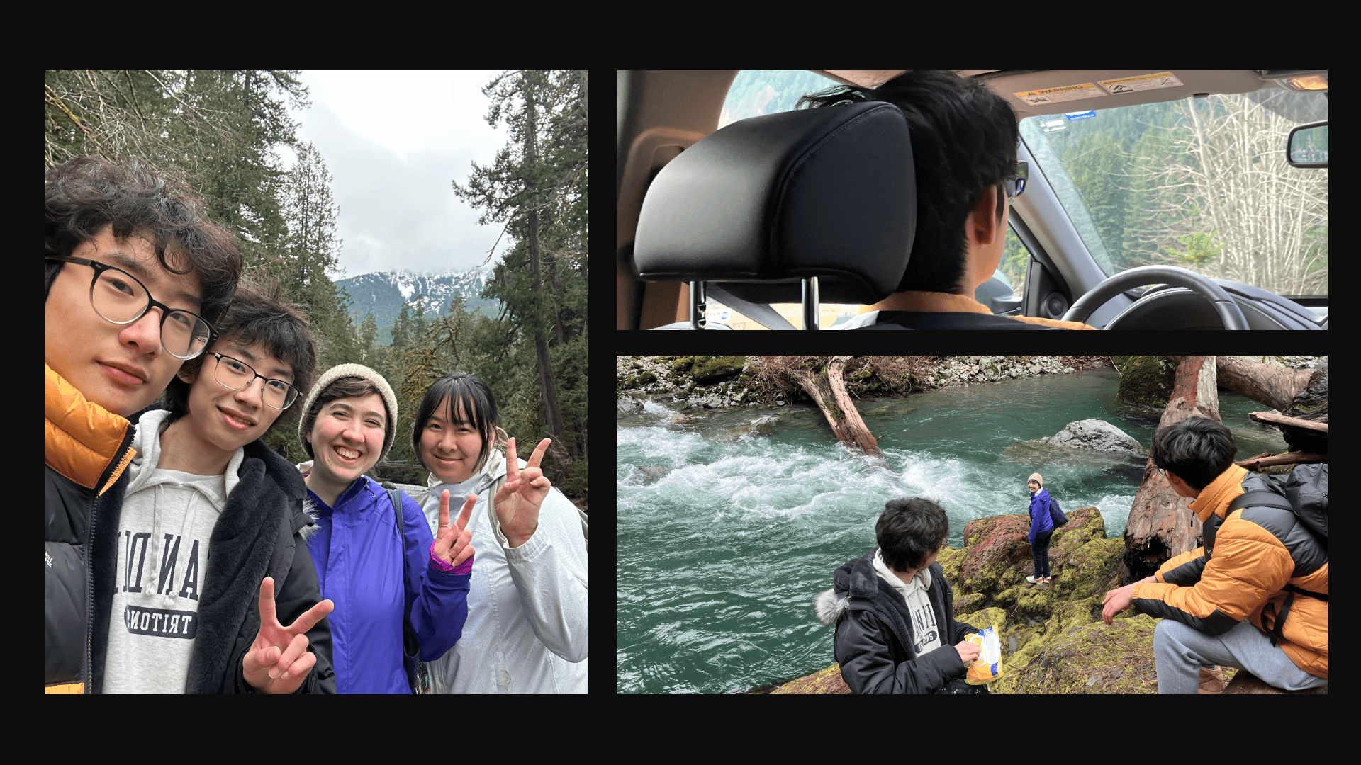
Drive 4 hrs a day to do field research in the mountain :D
Challenge
Short Timeframe: Limited duration prevented creating a full component set and required tightly scheduled interviews, impacting research depth.
Components: It is my first time designing and making interactive and reusable component, and it would be challenging to understand how it works in the beginning.
The Problem Background
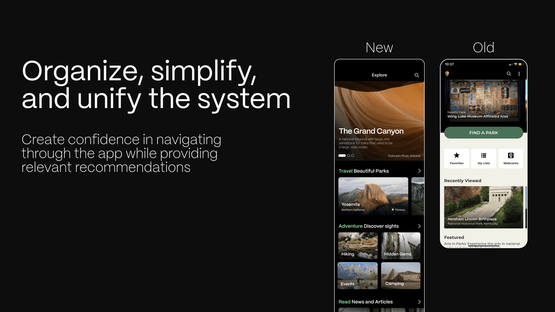
The NPS App is the new official app for the National Park Service. It can find interactive maps, tours of park places, on-the-ground accessibility information, and much more to plan your national park adventures before and during your trip.
However, it has many non-unified design system and countless unnecessary nesting of pages that need to be reduced
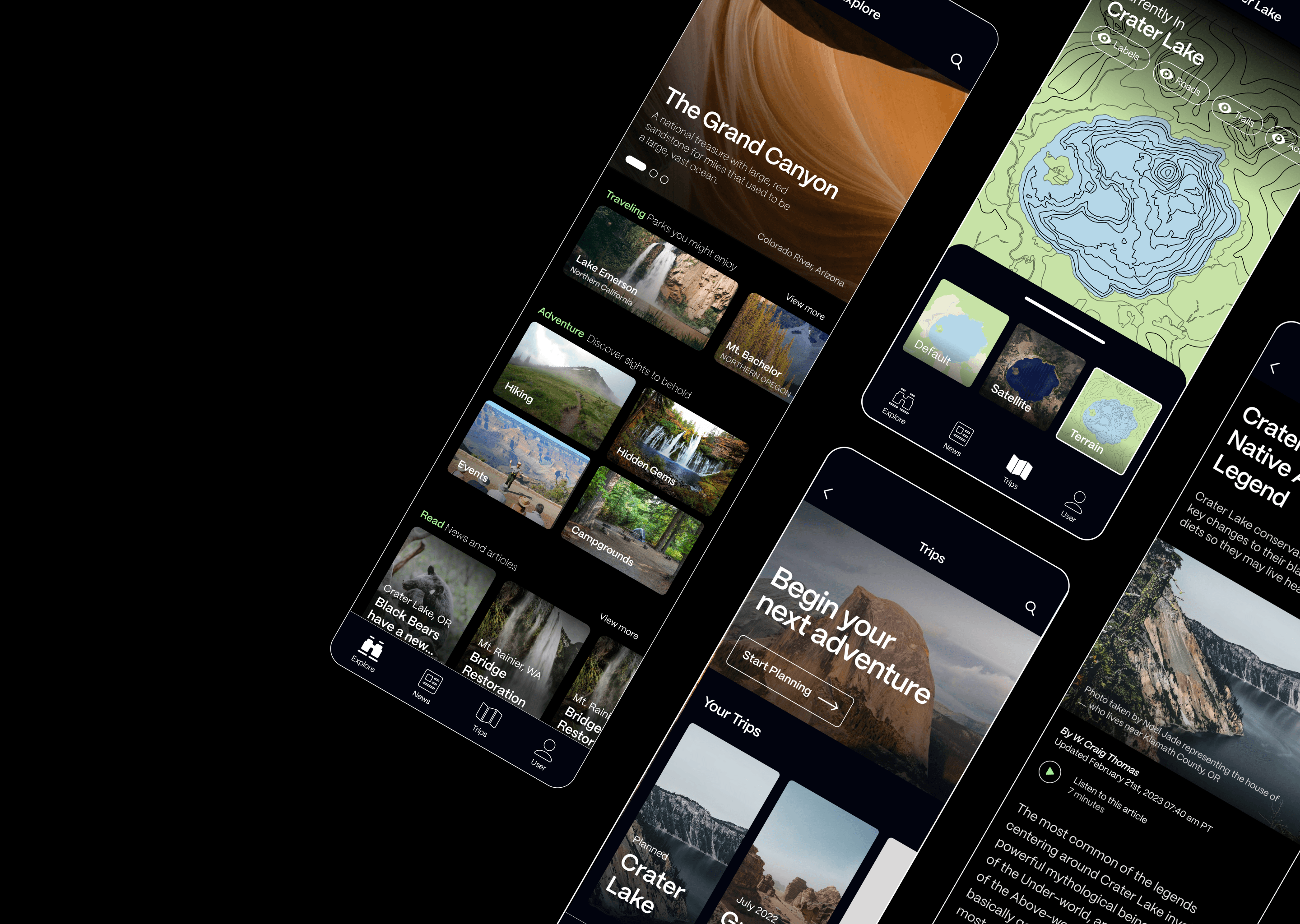
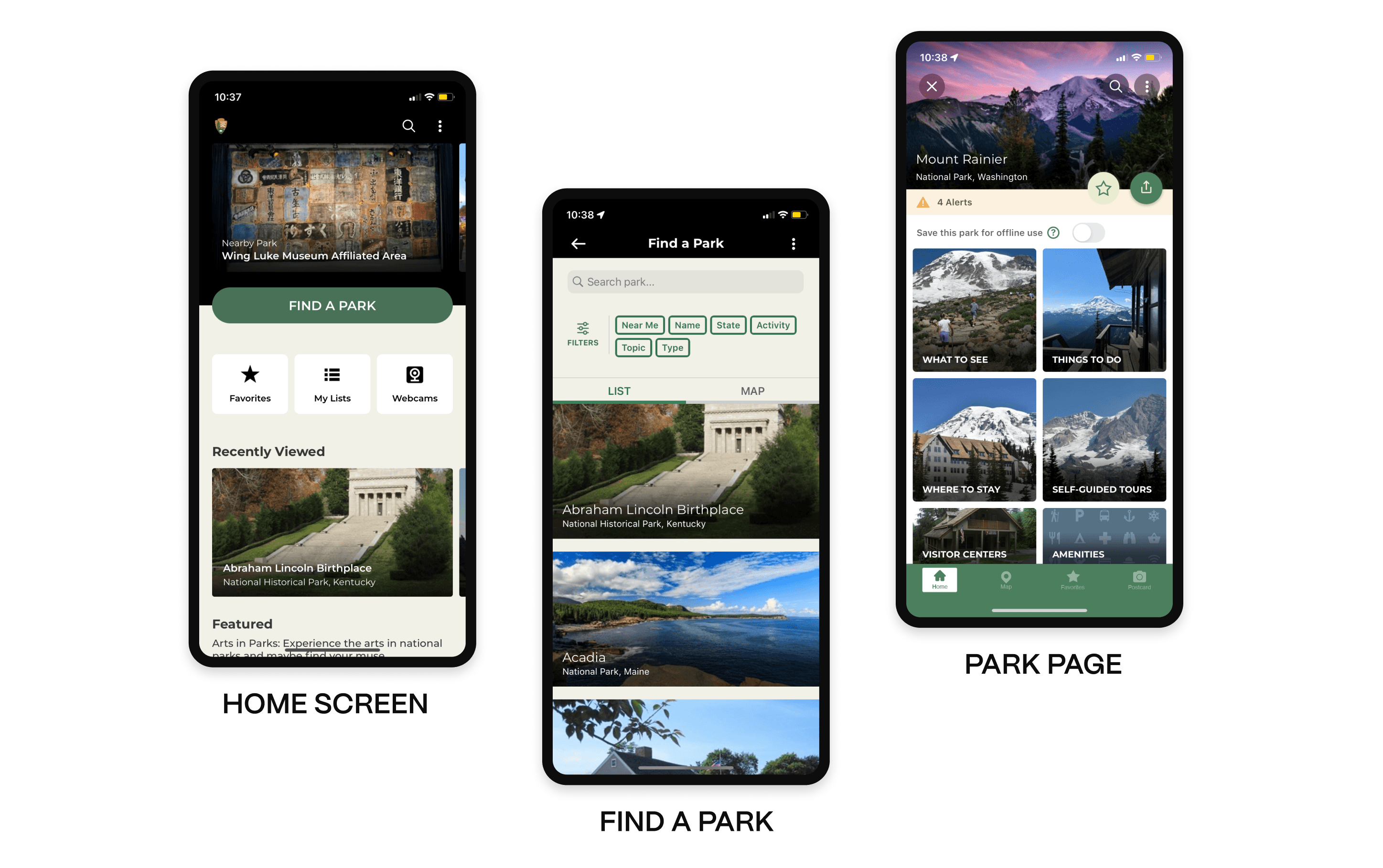
Final Design
Our final deliverable is an unified NPS app, featuring intuitive navigation, visually appealing design, and optimized content tailored to enhance user engagement and satisfaction.

EXPLORE
The app empowers users to effortlessly explore parks while staying updated with the latest information.
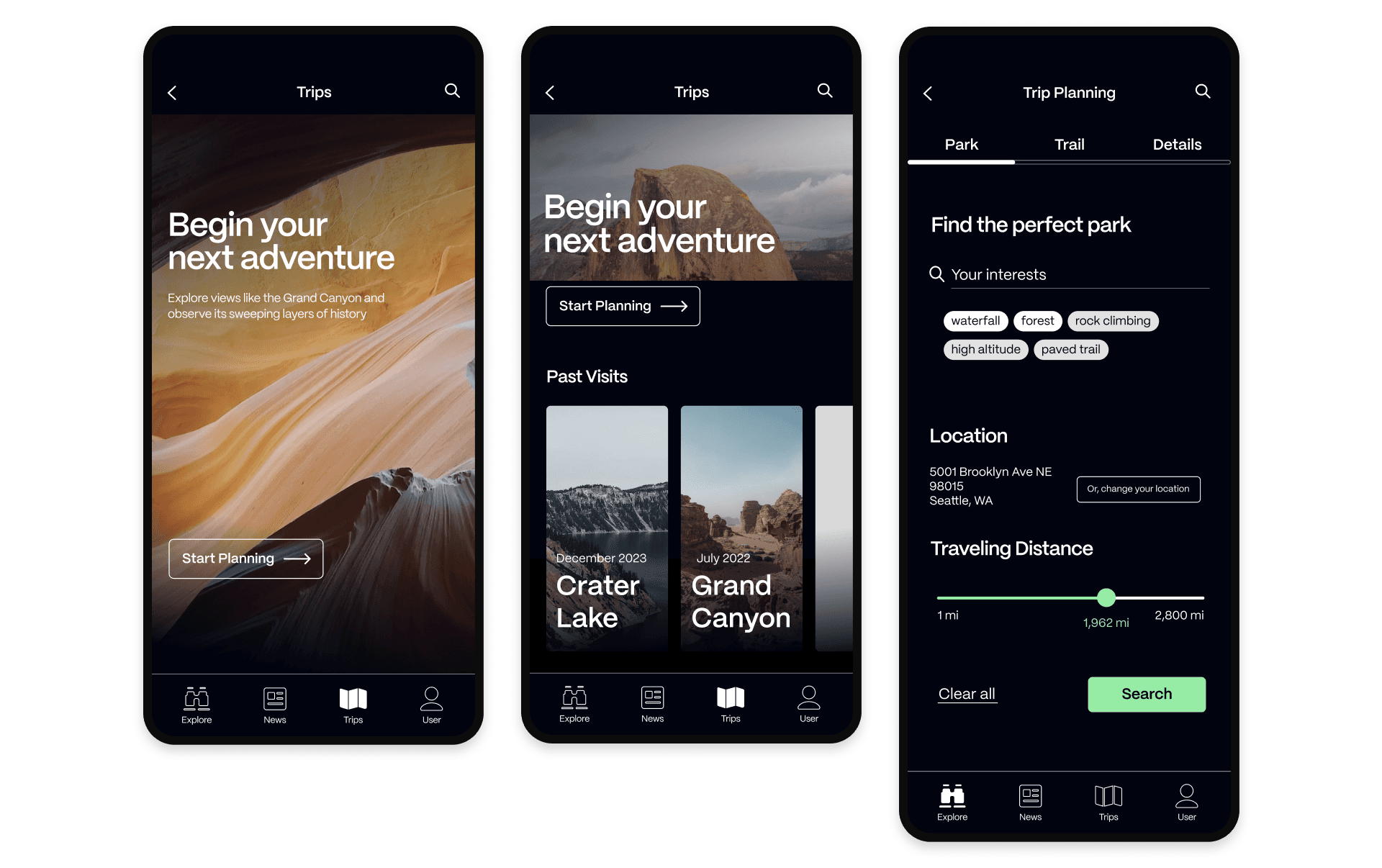
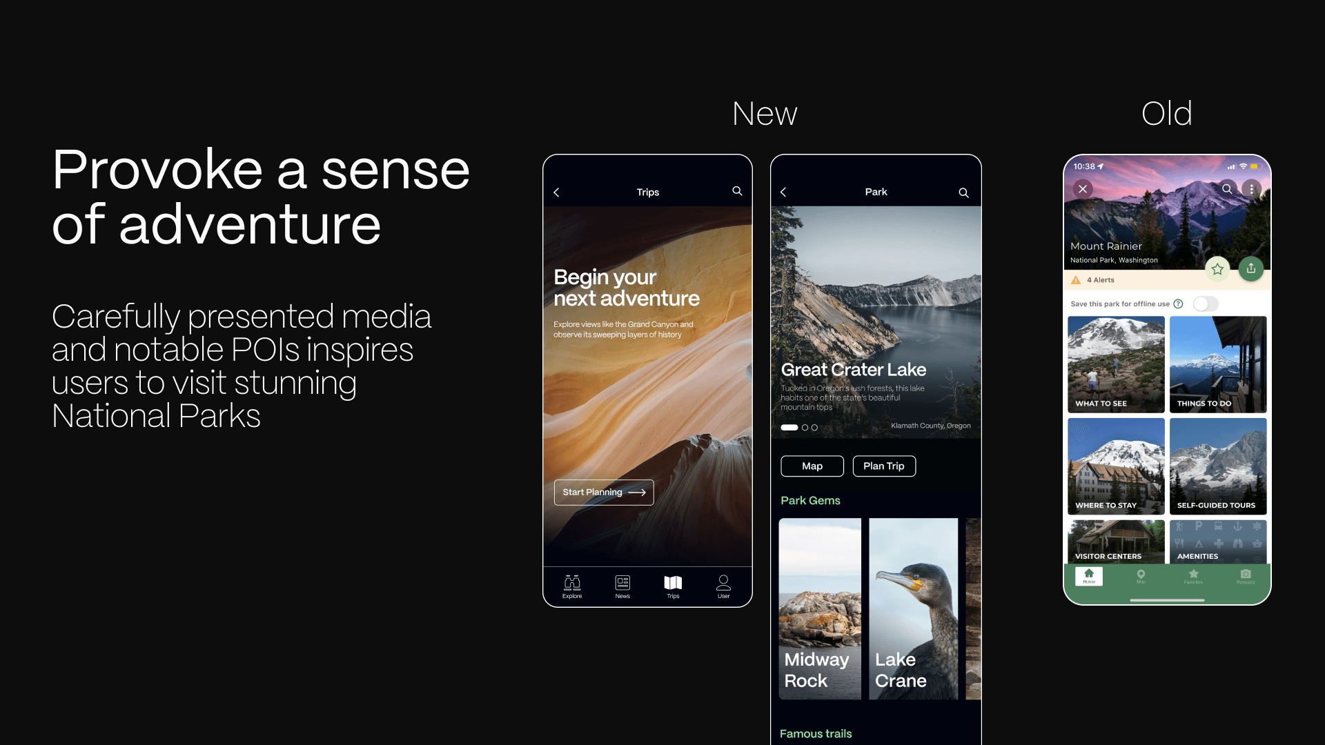
BEGIN
Users can seamlessly plan their adventures with customized and well-crafted itineraries, including details such as location, group size, and more.

LOCATE
The app provides features like destination recommendations, activity suggestions, and multiple map modes, along with the ability to download maps in advance to ensure users stay on track even without connectivity in the park.

READ
Users can explore updates on wildlife, such as seasonal migrations, discover events like guided hikes or educational workshops, and stay informed about important park news, including trail closures or safety advisories.

Process
Week 1-2
Research
Competitive Analysis
Problem Analysis
App Teardown
Week 3
Iteration
MoodBoard
Brainstorm
UX Strategy
Week 4-5
Design
Design System
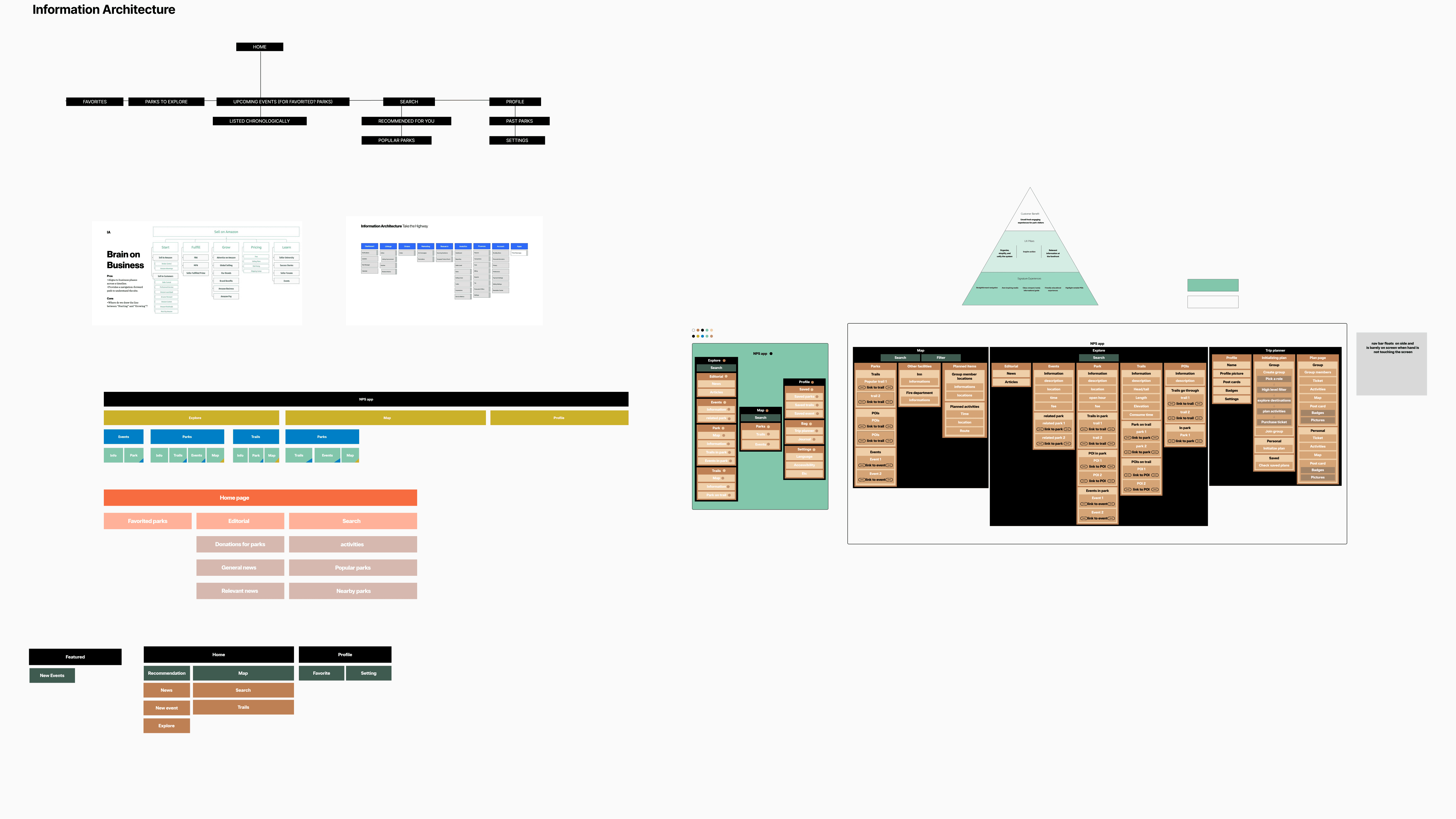
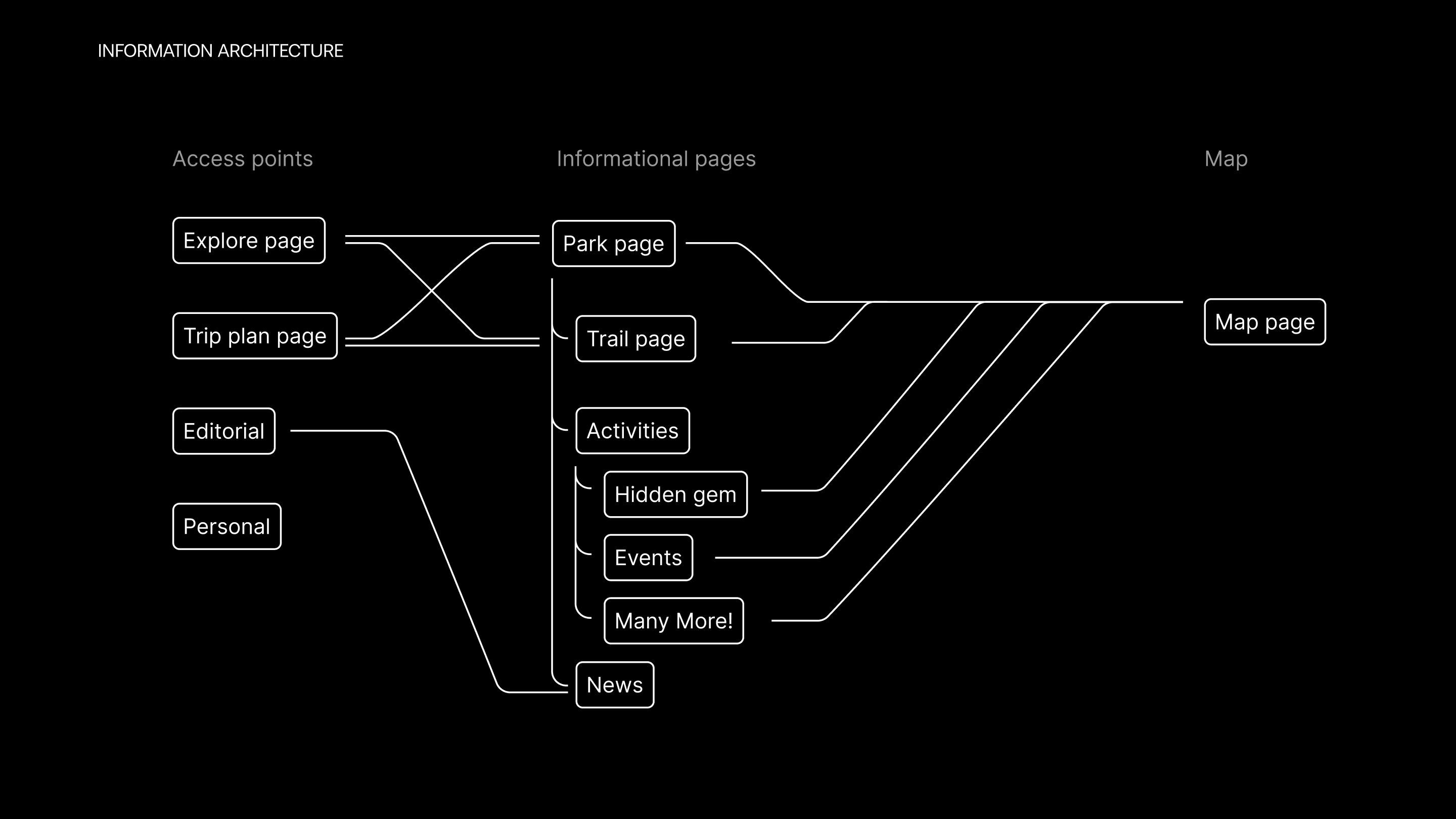
Information Architecture
Components
Prototyping
Week 6
Optimization
Refinement
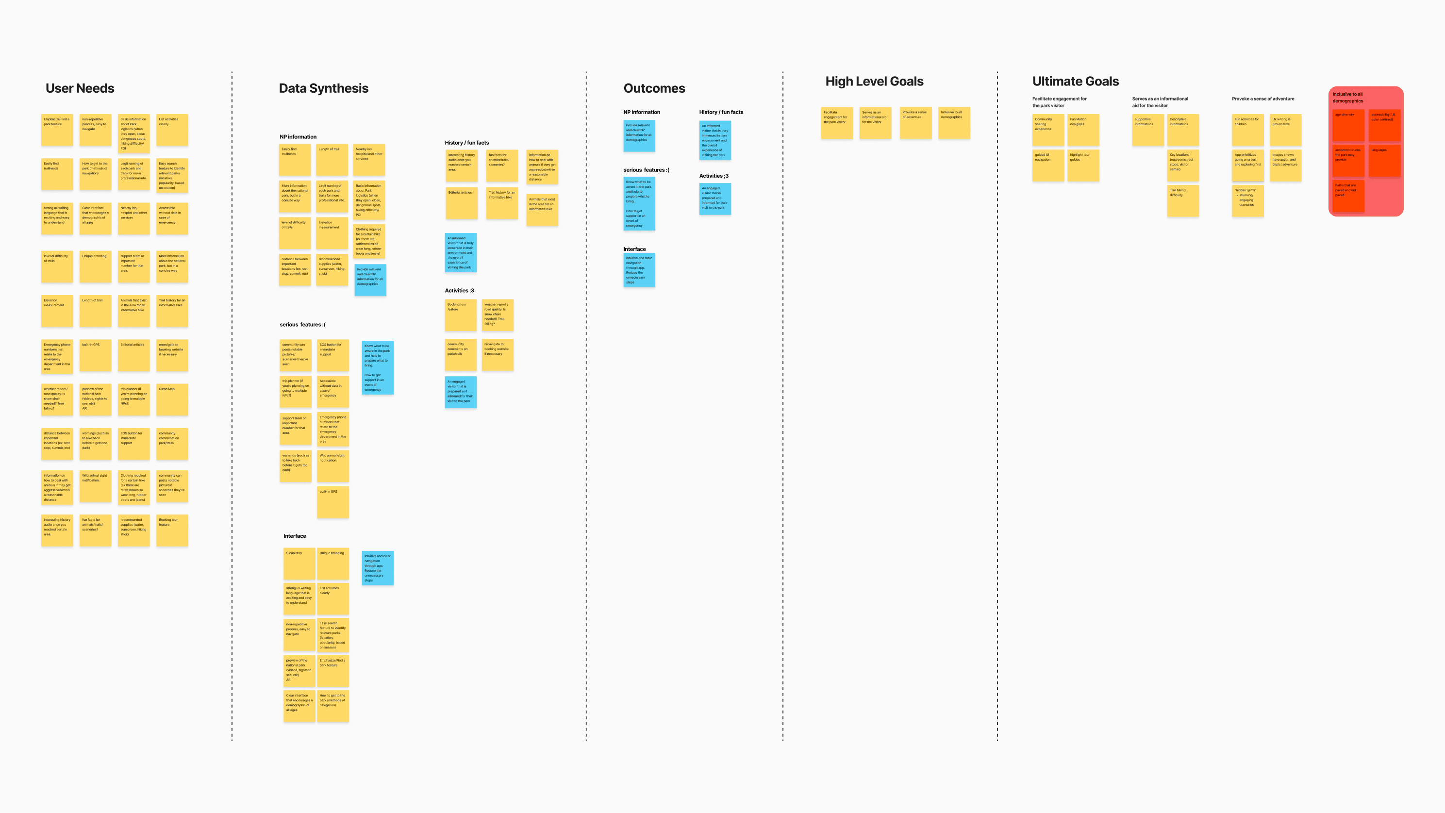
Research
Our team conducted comprehensive user testing by employing the app during an entire field trip that encompassed a hiking experience, thoroughly evaluating its performance and user satisfaction in a real-world outdoor setting.

Competitive Analysis
We conducted a competitor analysis and detailed teardowns of competing apps, gaining insights for our redesign.
Competitive Analysis
We conducted a competitor analysis and detailed teardowns of competing apps, gaining insights for our redesign.
Pain Point
The app suffers from layers within layers, inconsistent global navigation, and a lack of good information architecture.
Pain Point
The app suffers from layers within layers, inconsistent global navigation, and a lack of good information architecture.
Problems
SEARCH
The trip planning requires over five computer tabs for a simple park visit.
DISCOVER
Users need to research outside the app to discover more. Let's prompt that discovery within one application instead.
SCOPE
Choosing a park currently involves multiple steps to find the perfect trail, requiring checks on the area, weather, altitude, and more. This makes the process tedious and time-consuming.
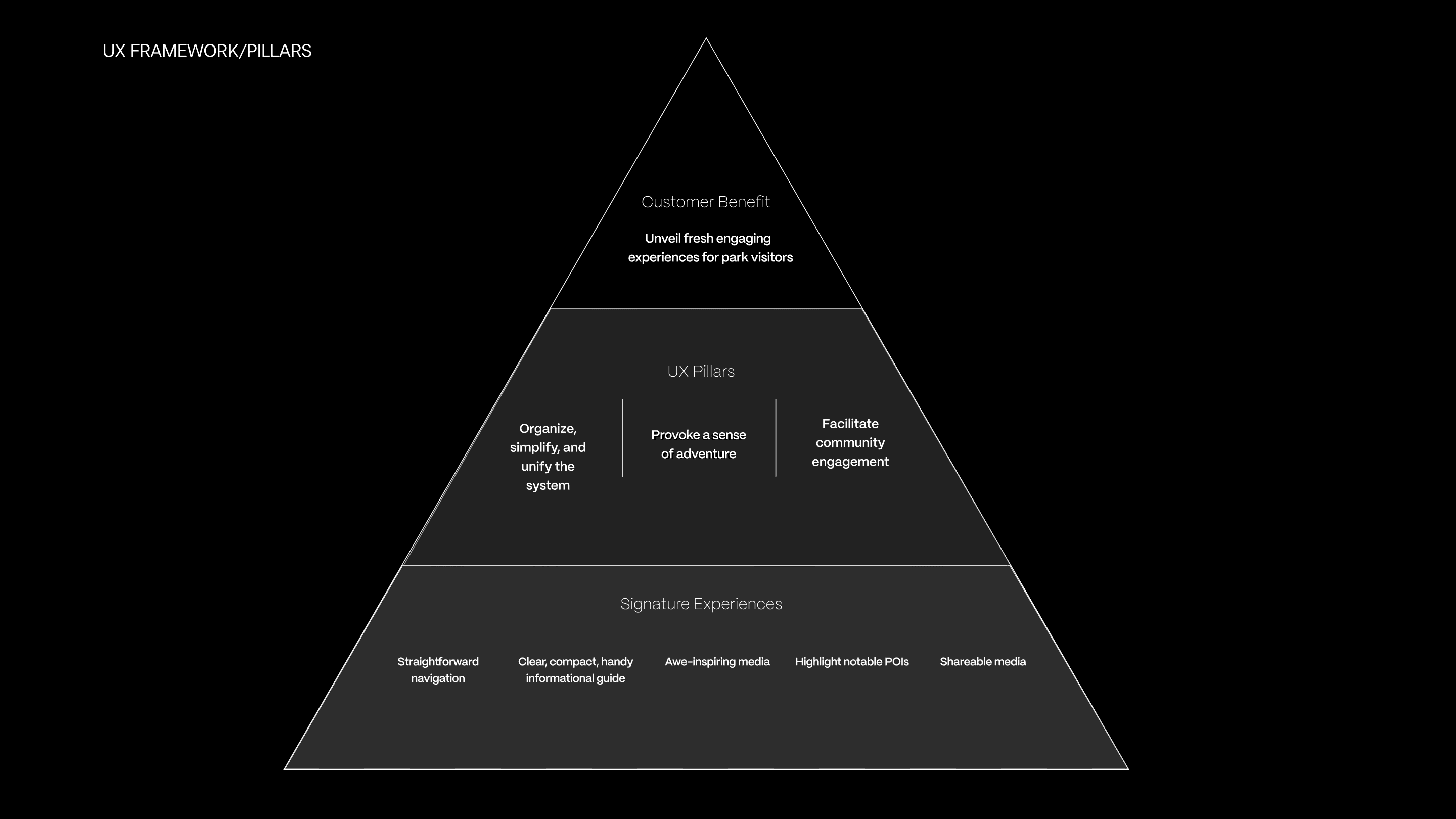
How might we…
redesign the National Parks App to be more intuitive and organized in a way that provokes an adventurous spirit and enhances both the UI design and user experience,
Brainstorm
Our team brainstormed intensively, using creative techniques to explore unconventional solutions and identify potential breakthroughs.
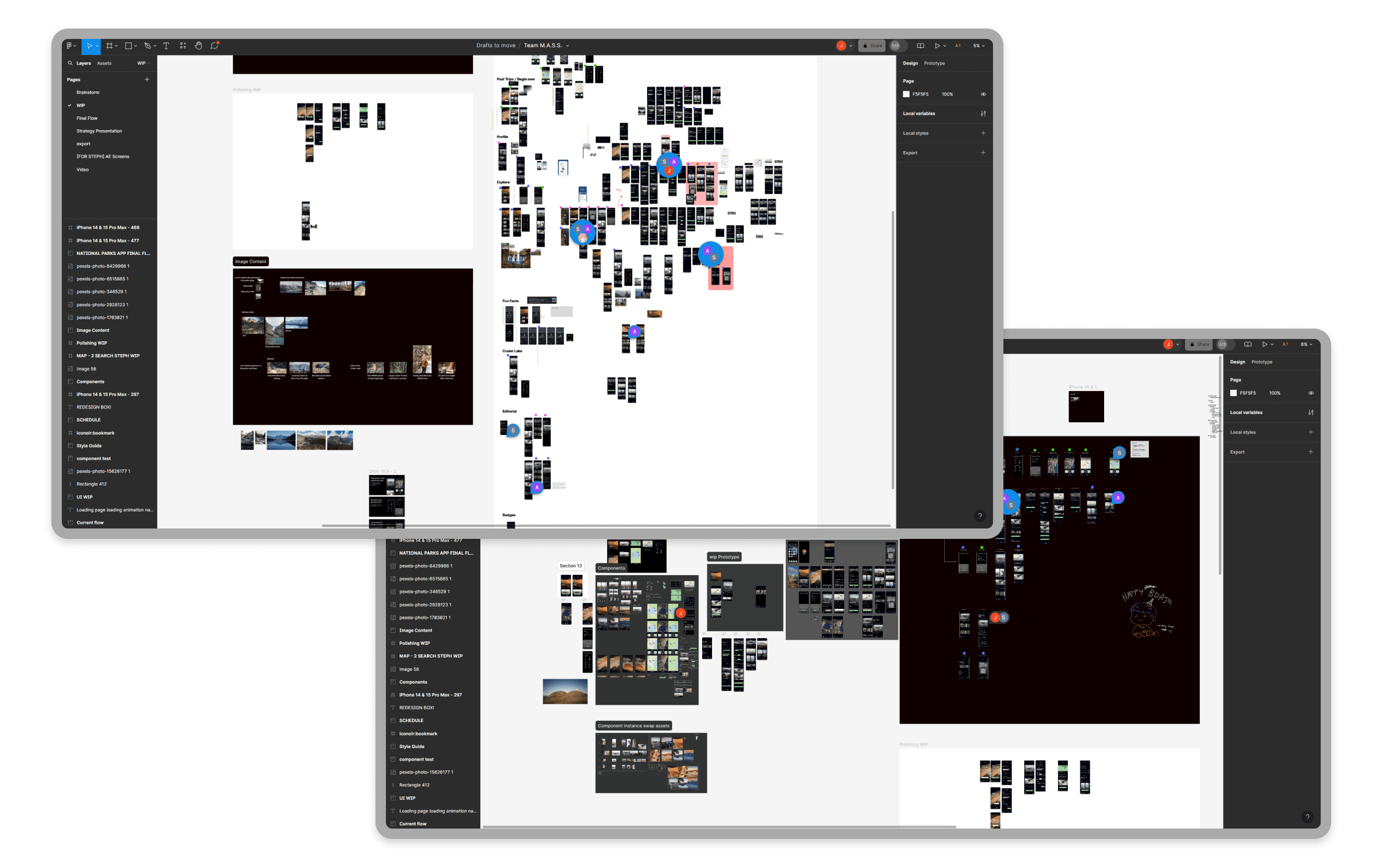
Work in Progress
UI/UX design
Our team starts to experiments on different styles and UI/UX design on Figma.
UI/UX design
Our team starts to experiments on different styles and UI/UX design on Figma.
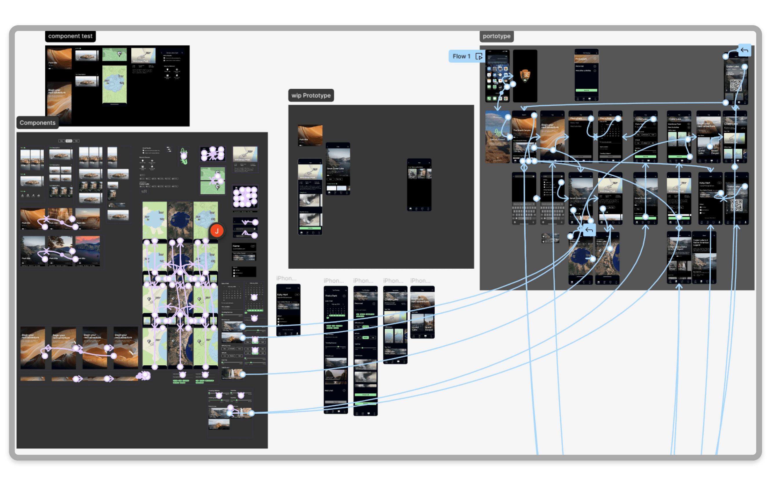
Prototype
After completing the component, my team and I starts to build prototype on Figma using components, which centuralized nodes connections.
Prototype
After completing the component, my team and I starts to build prototype on Figma using components, which centuralized nodes connections.
Design system
Below are the design system for the NPS app.


Prototype
Conclusion
What I learned?
It would be very important to plan things out and have a fundamental structure determined in the beginning of the process. It would make the work flow a lot faster.
If I had more time...
Our team would develop more functionality for the app, such as badge collection, emergency support, group planning, and etc.
National Park service
A tool to explore more than 400 national parks nationwide (NPS redesign).
Duration
6 weeks
Role
UI/UX designer
UX researcher
Tools
Figma
After Effect
Team
Jingzhou Ma
Alicia Betty
Stephanie Chou
Steve Wu
Project Overview
Summary
This class project, assigned by Bill Flora (Strategic Consultant and Creative Director in NYT), focuses on redesigning an app for travel planning and news checking.
My Part
Facilitated team progress with regular checkpoints and synchronized updates.
Conducted comparative analysis across similar apps.
Built information architecture for a clean user experience.
Crafted multiple reusable components in Figma using a flex-box format.
Designed and enhanced user flow prototypes in Figma for optimal performance.
Drive 4 hrs a day to do field research in the mountain :D
Challenge
Short Timeframe: Limited duration prevented creating a full component set and required tightly scheduled interviews, impacting research depth.
Components: It is my first time designing and making interactive and reusable component, and it would be challenging to understand how it works in the beginning.
The Problem Background
The NPS App is the new official app for the National Park Service. It can find interactive maps, tours of park places, on-the-ground accessibility information, and much more to plan your national park adventures before and during your trip.
However, it has many non-unified design system and countless unnecessary nesting of pages that need to be reduced
Final Design
Our final deliverable is an unified NPS app, featuring intuitive navigation, visually appealing design, and optimized content tailored to enhance user engagement and satisfaction.
EXPLORE
The app empowers users to effortlessly explore parks while staying updated with the latest information.
BEGIN
Users can seamlessly plan their adventures with customized and well-crafted itineraries, including details such as location, group size, and more.
LOCATE
The app provides features like destination recommendations, activity suggestions, and multiple map modes, along with the ability to download maps in advance to ensure users stay on track even without connectivity in the park.
READ
Users can explore updates on wildlife, such as seasonal migrations, discover events like guided hikes or educational workshops, and stay informed about important park news, including trail closures or safety advisories.
Process
Week 1-2
Research
Competitive Analysis
Problem Analysis
App Teardown
Week 3
Iteration
MoodBoard
Brainstorm
UX Strategy
Week 4-5
Design
Design System
Information Architecture
Components
Prototyping
Week 6
Optimization
Refinement
Research
Our team conducted comprehensive user testing by employing the app during an entire field trip that encompassed a hiking experience, thoroughly evaluating its performance and user satisfaction in a real-world outdoor setting.
Competitive Analysis
We conducted a competitor analysis and detailed teardowns of competing apps, gaining insights for our redesign.
Pain Point
The app suffers from layers within layers, inconsistent global navigation, and a lack of good information architecture.
Problems
SEARCH
The trip planning requires over five computer tabs for a simple park visit.
DISCOVER
Users need to research outside the app to discover more. Let's prompt that discovery within one application instead.
SCOPE
Choosing a park currently involves multiple steps to find the perfect trail, requiring checks on the area, weather, altitude, and more. This makes the process tedious and time-consuming.
How might we…
redesign the National Parks App to be more intuitive and organized in a way that provokes an adventurous spirit and enhances both the UI design and user experience,
Brainstorm
Our team brainstormed intensively, using creative techniques to explore unconventional solutions and identify potential breakthroughs.
Work in Progress
UI/UX design
Our team starts to experiments on different styles and UI/UX design on Figma.
Prototype
After completing the component, my team and I starts to build prototype on Figma using components, which centuralized nodes connections.
Design system
Below are the design system for the NPS app.
Prototype
Conclusion
What I learned?
It would be very important to plan things out and have a fundamental structure determined in the beginning of the process. It would make the work flow a lot faster.
If I had more time...
Our team would develop more functionality for the app, such as badge collection, emergency support, group planning, and etc.